Project background and objectives
Why create a design system?
The main business of the company includes B-end services for physical hospitals—smart hospitals and Internet hospitals; and C-end services aimed at users—Nengyi and Nengdoctor, along with Nenghu and comprehensive management of chronic diseases. They run multiple products in various forms and lines, particularly smart hospitals and Internet hospitals, which have gone through 4 iterations, intervening in over 1,000 physical hospitals and covering 600 million users. This requires efficient responses to the needs of implementation teams in different regions.
The original version 4.0 was designed using Sketch and had a simple design specification, while other products extended the design based on the smart hospital style. The business units responsible for different products are relatively independent, and the levels of corresponding product managers, project managers, and designers vary significantly. This leads to a lack of high consistency across different products of the same company, with relatively low efficiency in responding to design needs and high costs for transforming the same pages and functional components.
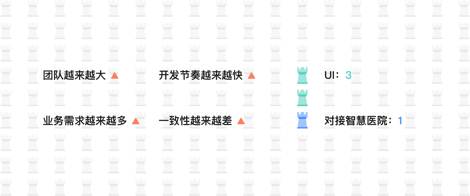
Our goal
The main business of the company includes B-end services for physical hospitals—smart hospitals and internet hospitals; and C-end services for users—Nengyi, Nengdoctor, as well as Nenghu, and comprehensive management of chronic diseases. There are multiple forms and product lines operating in parallel, especially the smart hospitals and internet hospitals, which have gone through 4 versions of iteration and have been implemented in over 1,000 physical hospitals, covering 600 million users. It is necessary to efficiently respond to the needs of various regional implementation teams.
Project background and objectives
Why create a design system?
As designers, creating elegant designs is a basic responsibility, but no design system should stop at the visual design level alone. Consistency and elegance in visual design are certainly important, but if you build a design system without considering real business scenarios, it won’t be able to work in actual projects and will ultimately become nothing more than a designer’s self-indulgent creation.
Style settings
First, based on atomic theory and an 8-pixel grid design system, establish the foundational style settings and layout of the entire design system. Define a color system based on the brand colors, a grayscale system, typography, border radius, shadows, and more, to ensure the entire system is built with a consistent visual tone.

Component extraction
Card binding, registration, consultations, payments, and querying various medical visit records are core business scenarios for smart hospitals/internet hospitals. These include record cards and doctor/hospital cards, as well as common components such as input forms, overlays, and pop-up dialogs. By designing these common business components in a unified way, we can ensure consistency and practical implementation across 70% of the core scenarios in the entire system.

Component Building
Instances built from basic components (business components) are key to bringing the business to life. In handoff to designers/product managers for collaboration, 70% of the work is at the instance layer. Usability should be fully considered, and basic components should be controlled and switched through toggles, type or state selection, transforming them into component styles in different states.
Based on the "atomic theory," it is recommended to further refine the "element" layer. The element layer has the smallest granularity and can be used as building blocks for basic components, ensuring that these basic components can also switch states by swapping element components. For example, for a calendar component, we need to use it together with other component styles to form different business scenarios, such as department lists and doctor lists, while also being able to quickly switch between different calendar views. Based on this, we can use element components to build a basic calendar component. The calendar component belongs to the atomic level. If we do not build it with element components and instead construct it directly with text and shapes, it is impossible to quickly switch a single-day style or to ungroup it and change the text and the colors of the text and shapes for different states. As a result, the whole component becomes inefficient and is reduced to a styling layer only. Grouping all elements into one large component category without disrupting the atomic structure also makes maintenance easier and supports global replacement of component styles. It is recommended that the element layer not be exposed externally.

A truly well-designed component needs to support switching between different styles and states. At the same time, it should keep the number of component variants in check, reduce redundancy, and stay lightweight. Too many components not only make maintenance harder, but also increase the cost of using them. When it comes to using components, having too many is undoubtedly overwhelming for users.
We can build using Figma’s component variants and component properties together. Component properties let you avoid constantly clicking into components to select the object you want to change; instead, you can edit directly on the component itself. In the sidebar, you can modify text, swap components, and control whether content is shown, which greatly reduces the number of variants—after all, each variant is a component. Variants can then be used for different states of the same type of component when component properties can’t meet the requirements.
Taking the "Function List Component" as an example, the component needs to support icon changes, title changes, switch mode, whether the guide arrow is displayed, reminder information, and field information. By switching between different component elements, it can be transformed into different states of the "Function List Component".
If you rely solely on component variants to build things, you’ll end up with more than a dozen components, as shown below (this was how it was when I first started building the component library: there was no component properties feature, and each style was a separate component variant).
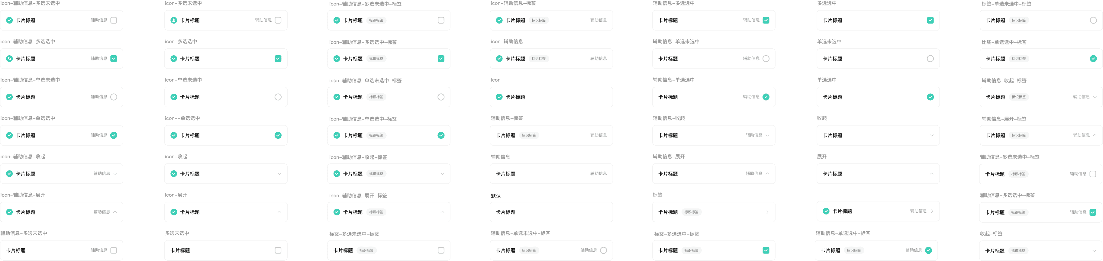
Use component properties to control icon display, text changes, field information display and editing, reminder message display and editing, single-select, multi-select, and arrow selection. Show and hide are implemented through layer visibility, which also uses the basic data type for development: boolean. Text changes are handled through text properties, while icons (images from a built-in shared icon library) are switched through component properties. After setup, we only need one component—no variants required—to achieve effects that previously took more than ten components. At the same time, 80% of the operations are directly exposed in the sidebar, making them more convenient and easier to use. Designers and product managers alike can get started with ease.

Component Documentation
After completing component development, use scene instances and shared components to build templates according to unified layout and interaction standards. Templates help you build pages better and faster, further improving efficiency. Not every business or every page needs a template; you only need to create pages that you consider representative in terms of layout.

模板
After completing component construction, build templates by combining scene instances and shared components according to unified layout standards and interaction rules. Templates help you build pages more effectively and faster, further improving efficiency. You don’t need to create templates for every business scenario or every page—just build pages that you consider representative in terms of layout.
