Design optimization and adjustment
Visual upgrade Standard upgrade
Manager Mu and Business Manager
1. On the homepage, about 10% of hospitals require a clear card binding entrance and a prominent medical record card, supporting quick card binding, displaying the medical code and the patient.
2. During implementation, there will be few functions available for hospitals. After configuring the standard version, the homepage appears particularly empty and unattractive. Hospitals also feel that it is not rich enough and need to quickly configure a homepage with different quantities of available features.
3. The design styles are not rich enough. Some hospitals want a tile function, some want only classification, some want the same color, some do not want different types of functions to use different colors, some want more than just displaying 4 items in a row, some want a clover layout, and so on. Hospitals have diverse needs.
hospital
Feedback on the new homepage icon indicates that the texture is not sufficient. Hospitals, as traditional service organizations, still have limitations when it comes to aesthetic and design needs. However, these issues deserve respect rather than dismissal. One should stick to their own insights, after all, the needs of Party A determine market feedback.
Experience Design Department
After a year of use, maintenance of design and functions, some design styles need optimization and adjustment, and interactions need to be further unified.
1. Visual & Design System Upgrade Optimization
Visual Optimization
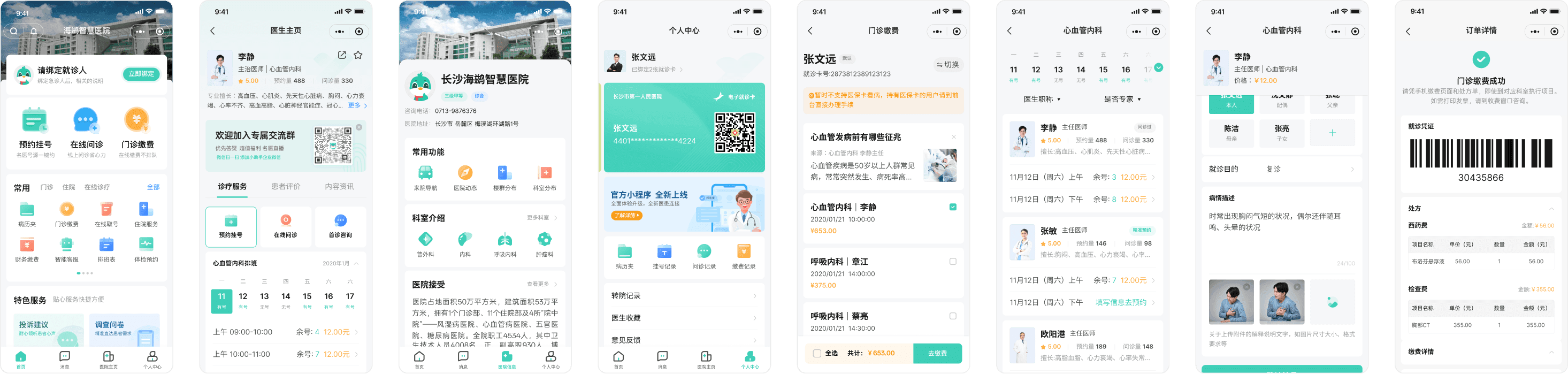
Re-optimize the global style design, reduce the corner radius, decrease the layout and spacing, creating a more stable overall style that can carry more content information elements, enhancing users' sense of safety when seeking medical care and conveying the professionalism of the hospital. At the same time, incorporate brand elements into the page for greater brand exposure.
Design system
Full support for Figma's latest Auto Layout 4.0 and component properties, with the overall number of components reduced by about 30% compared to before. During the iterative design process of the integrated version, the collaborative component library was optimized together, and the mobile standards related to doctor cards and content cards were reorganized.

2. Main function icon optimization
First is the main function icon, starting with shaping texture and layering, adopting a light skeuomorphic + frosted glass design scheme (of course, during this process, five versions were designed, but the files were lost and cannot be found 🤣)
The icon is divided into two parts. The main part should closely resemble the real appearance of the functional scene, which is a light skeuomorphism that provides recognizability and texture. The secondary part consists of an overlay of frosted glass style icons from the bottom right corner, responsible for decoration and enhancing functional attributes, while also adding a sense of depth.

3. Function icon optimization
The global optimization of this functional icon first determines that we will not adopt the old version's highly saturated gradient scheme. Instead, we will create a gradient effect based on the existing colors. At the same time, relying on Figma's component library synchronization feature, each icon can achieve custom colors by changing the main color in the color property panel, meeting the hospital's needs for unified and customized colors.
2. The visual configuration area supports switching between three homepage design modes, allowing for quick design based on practical project situations on top of design templates. 3. The main feature and secondary feature areas provide different configuration templates that can be quickly configured based on the selected template styles and the features to be launched according to actual project needs. Additionally, the secondary feature area icons support custom colors; you simply input the color values to customize different categories with different colors, or the same color for the entire feature area.

Function & Efficiency Optimization Improvement
Various styles of functional modules Backend upgrade
Homepage feature module design with multiple styles
Add card binding and visit card display to the top of the Home page and keep them fixed there: since the visit visualization card is also shown at the top, the binding and display of the visit card will now be treated by default as the first step in the visit visualization flow, making it compatible with the page design after enabling the visit visualization feature.
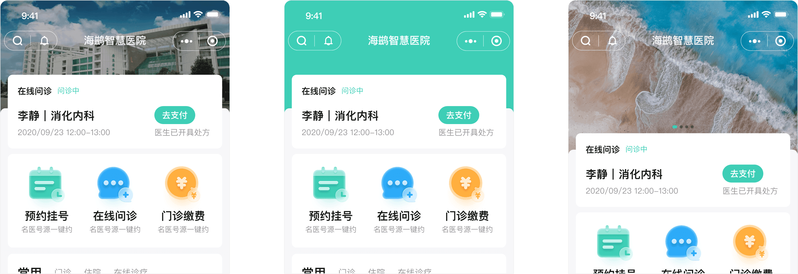

Multi-functional design with a variety of styles
Primary and secondary functions offer design options with different numbers of features and interaction styles, to serve as configuration templates. For example: two items per row, expand, swipe, and more.

Multimodal design
Based on the optimization points above, we provide a standard template, a concise template, and a minimalist template to match different homepage configuration scenarios, enabling project managers and business managers to quickly complete configuration and launch. (In minimalist mode, a new hospital card has been added. In addition to enriching the visual experience, it also avoids the plain, low-quality feel caused by overly limited functionality, while emphasizing the official nature of the product.)

New Backend Configuration Features
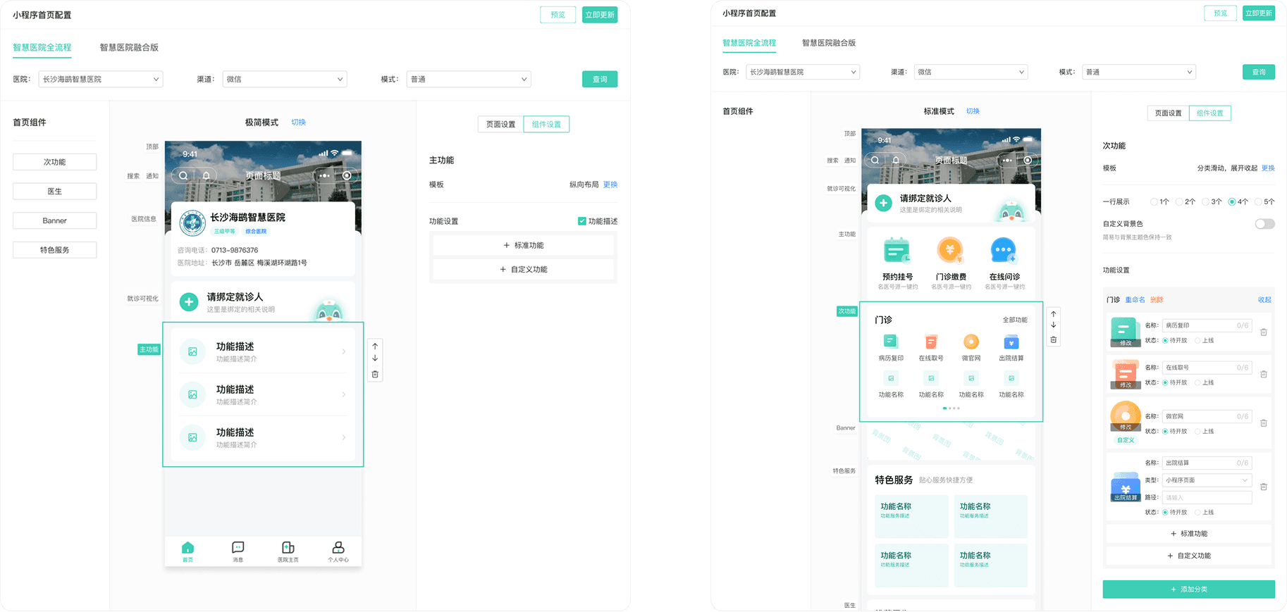
1. Split all modules on the homepage into independent components. You can freely add them from the component library on the left, delete them or drag them to reorder them in the visual configuration area in the center, and select a component to make a wide range of custom settings in the component settings area on the right.
2. The visual configuration area supports switching between three homepage design modes, allowing for quick design based on practical project situations on top of design templates. 3. The main feature and secondary feature areas provide different configuration templates that can be quickly configured based on the selected template styles and the features to be launched according to actual project needs. Additionally, the secondary feature area icons support custom colors; you simply input the color values to customize different categories with different colors, or the same color for the entire feature area.
3. The main function and sub-function area provide different configuration templates. You can choose the functions to go live based on the actual project situation by selecting the desired template style for quick configuration. Additionally, the sub-function area icon supports custom colors; you just need to input the color value. You can customize different categories with different colors, and the entire function area can have the same color. The result module adopts a list style design to avoid the situation in the old version where project names that were too long would need to wrap to the next line. Each inspection result is clearer, and abnormal results are easier to identify. It also supports viewing and comparing past inspection results.
Partial page display
Report Query
Redesign the report search feature using a card-based layout, reorganizing the information so the title, basic information, and examination results sections are clearer and more orderly.
The inspection results module uses a list style design, avoiding the situation where inspection item names are too long and need to wrap in the old version form style; each piece of inspection result is clearer, and abnormal results are easier to identify, while also supporting the feature to view and compare previous inspection results.


Doctor Home Page Optimization
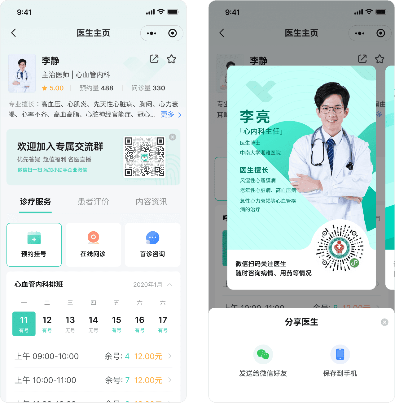
Refine the typography and proportions of the avatar, personal information, and profile details to enhance the overall look and cohesion; replace the previous tag-style display for specialties, addressing issues in implementation such as the complexity of maintaining doctor profiles and the need to condense content and consider tag length, making maintenance easier while presenting doctors’ areas of expertise more completely. Introduce the brand logo.
Redesign of the switching styles for different functional services, making them more aesthetically pleasing and recognizable; bold date display on the schedule calendar, with a larger range for selected styles, enhancing the user experience.

Integrated standard version - maternal and child, traditional Chinese medicine style design
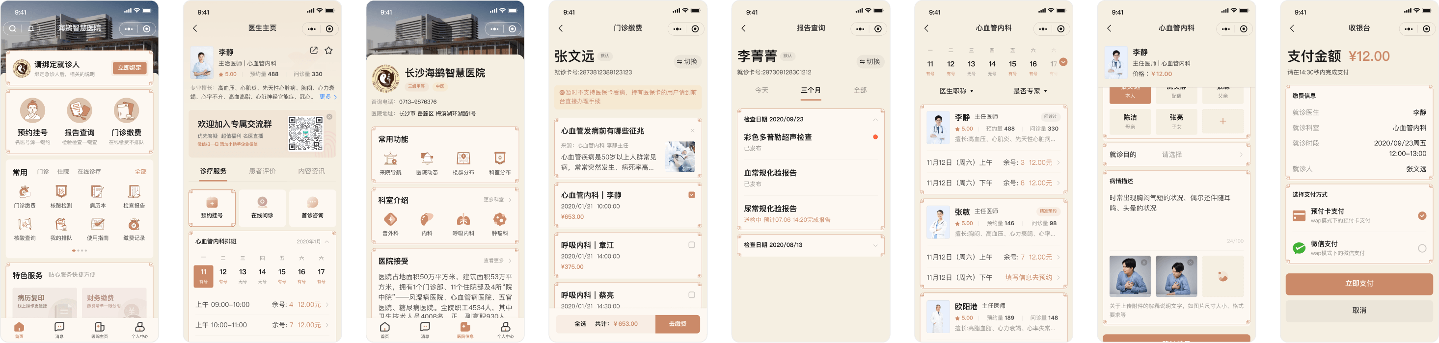
Designed standard versions in maternity/childcare and traditional Chinese medicine styles, with complete design coverage for the homepage in multiple layouts, personal center, hospital homepage, doctor homepage, and the full registration, payment, and inquiry flow. The maternity/childcare style uses pink as the main color, with softer, rounder icons to create a warm and caring user experience. The traditional Chinese medicine style uses a classic brown palette with Chinese-inspired borders, evoking the rich heritage of traditional Chinese medicine.